Is your website suffering from sluggish load times? Chances are, the culprit is staring right back at you: oversized images. In today’s fast-paced digital world, a one-second delay in page load time can lead to a 7% reduction in conversions.
But “downsizing” an image isn’t just about making it smaller. It’s a precise process of delivering the right image, in the right size, in the right format. This complete guide will walk you through everything you need to know about using an image downsizer strategy to supercharge your website speed, improve your SEO, and keep your visitors happy.
Why Image Downsizing is Non-Negotiable for a Modern Website?
Before we dive into the “how,” let’s understand the “why.” Large, unoptimized images have a cascading negative effect:
- Slow Page Load Times: Images often account for over 50% of a webpage’s total size. The larger the files, the longer a user’s browser takes to download them.
- Poor User Experience (UX): Modern users expect instant gratification. Slow-loading pages lead to high bounce rates and frustrated visitors.
- Damaged SEO Rankings: Google uses Core Web Vitals as a ranking factor. Two of these—Largest Contentful Paint (LCP) and Cumulative Layout Shift (CLS)—are directly impacted by poorly sized images and increase image delivery time
- Wasted Bandwidth: This is especially critical for mobile users with limited data plans. Serving a 2000px wide image to a mobile phone is inefficient and costly for your users.
The #1 Mistake: Serving Larger Images Than Displayed
Here is a common and easily fixable error you might have seen in Google PageSpeed Insights:
“This image file is larger than it needs to be (AxB) for its displayed dimensions (CxD). Use responsive images to reduce the image download size.”
What does this mean? Your website’s code is telling the browser to display an image at CxD pixels. However, the actual image file you uploaded is AxB pixels. The browser is forced to download a much larger file than necessary and then shrink it down on the fly.
The Solution: Serve downsized images that match their display size as closely as possible. This single step can reduce image file sizes by and help you with responsive images
Step-by-Step Guide to Professional Image Downsizing
Step 1: Determine Ideal Image Dimensions for Your Website
There is no one-size-fits-all answer. You need to audit your own site. Use your browser’s “Inspect Element” tool to check the displayed width of images in different sections.
Here are common benchmarks:
- Full-Width Hero Image: Match your container’s max width (e.g., 1920px for desktops, but served responsively).
- Blog Post Featured Image: Typically 1200px wide is sufficient for high-DPI (Retina) displays.
- In-content Blog Images: Align with your content column width (e.g., 768px).
- Website Thumbnails: Often as small as 300px x 300px.
- E-commerce Product Gallery: Use a multi-size approach (e.g., 100px thumbnail, 500px gallery view, 1200px zoom view).
Step 2: Resize Your Images Before Uploading
Never upload a straight-from-camera photo (which can be 6000px wide) directly to your website. Use an image editor or a dedicated image downsizer tool to resize the image to the exact dimensions you determined in Step 1.
Tools for the job:
- Free: GIMP, Photopea (online), Canva, ResizeImage IO
- Paid: Adobe Photoshop, Affinity Photo.
- Automated: Your CMS plugins (see below) often handle this on upload.
Step 3: Choose the Optimal File Format (WebP vs. JPEG vs. PNG)
Format choice is critical for balancing quality and file size.
- JPEG: Best for photographs and images with complex colors and gradients. Use progressive JPEGs for a better perceived loading experience.
- PNG: Best for images requiring transparency (logos, icons) or images with simple graphics, text, and sharp edges. PNGs are typically larger than JPEGs for photos.
- WebP: The modern champion. Developed by Google, WebP provides superior lossless and lossy compression. It can create images that are 25-35% smaller than comparable JPEGs and PNGs with the same quality. [Link to our detailed WebP conversion guide].
Step 4: Compress Without Sacrificing Quality
After resizing and picking a format, apply compression. The goal is to strip unnecessary metadata without visible quality loss.
- Lossless Compression: Removes hidden data without affecting image quality. Always do this.
- Lossy Compression: Reduces file size by selectively removing data. Find the “sweet spot” where the file is small, but the quality is still acceptable to the human eye.
Excellent Compression Tools:
- Free Online: TinyPNG, Squoosh.app , ResizeImage IO
- Desktop: ImageOptim (Mac), FileOptimizer (Windows)
- CMS Plugins: WP Smush (WordPress), Imagify
Advanced Downsizing Strategies
1. Implement Responsive Images with HTML srcset
Manually creating multiple sizes is only half the battle. You need to tell the browser which size to use. The HTML srcset attribute does this.
How it works: You provide a list of image files and their widths. The browser then automatically chooses the most appropriate one based on the user’s screen size and viewport.
Example:
html
<img src="/images/hero-small.jpg"
     srcset="/images/hero-small.jpg 511w,
             /images/hero-medium.jpg 1024w,
             /images/hero-large.jpg 1920w"
     sizes="(max-width: 600px) 511px,
            (max-width: 1200px) 1024px,
            1920px"
     alt="Descriptive alt text">
This code solves the PageSpeed Insights error by ensuring a mobile user doesn’t download the 1920px version.
2. Adopt a Mobile-First Image Sizing Strategy
With most web traffic coming from mobile, start by optimizing for small screens. Create your image sizes with mobile as the baseline, then provide larger versions for desktop users. This ensures mobile users get the fastest possible experience. [Learn more about mobile image optimization].
3. Leverage a Content Delivery Network (CDN)
A CDN stores copies of your images on servers around the world. When a user visits your site, they download images from a server geographically close to them, drastically reducing latency. Most modern CDNs also offer automatic image optimization, format conversion (to WebP), and resizing on the fly. [Explore how a CDN can speed up your image delivery].
The Impact on Core Web Vitals and SEO
By properly downsizing your images, you directly improve the SEO signals Google cares about:
- Largest Contentful Paint (LCP): Measures loading performance. A fast-loading hero image is often the LCP element. Downsizing it is the most effective way to improve your LCP score.
- Cumulative Layout Shift (CLS): Measures visual stability. Properly sized images with defined
widthandheightattributes prevent the page from jumping as images load.
Fixing these metrics leads to higher search rankings, more traffic, and more conversions.
Conclusion: Downsizing is a Continuous Process
Image optimization isn’t a one-time task. It’s an ongoing part of website maintenance. Every new image you upload is an opportunity to apply these image downsizer techniques.
Start by auditing your existing site with Google PageSpeed Insights. Look for the “oversized image” warning. Then, create a standard set of image dimensions for your site, convert your key pages to use WebP, and implement srcset for your most important visuals.
The result will be a faster, more professional, and more successful website.
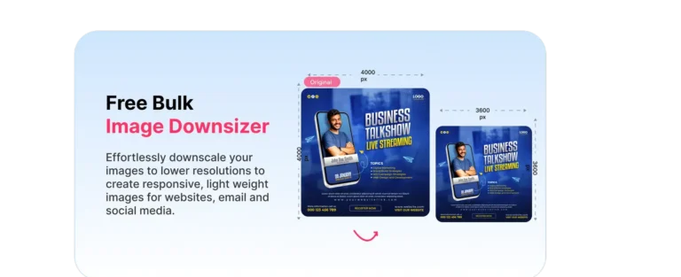
Tired of manually resizing and optimizing? Automatically downsize and optimize all your website images with our smart Image Downsizer Tool. It handles format conversion, compression, and responsive image generation in one click, saving you time and boosting your site’s speed.

