Ready for a stat that stops you mid-scroll?
75% of online shoppers say page speed directly affects whether they buy from a store.
And the single biggest drag on your store’s speed? Images. Product photos, hero banners, thumbnails — they make up 60-70% of the average e-commerce page weight.
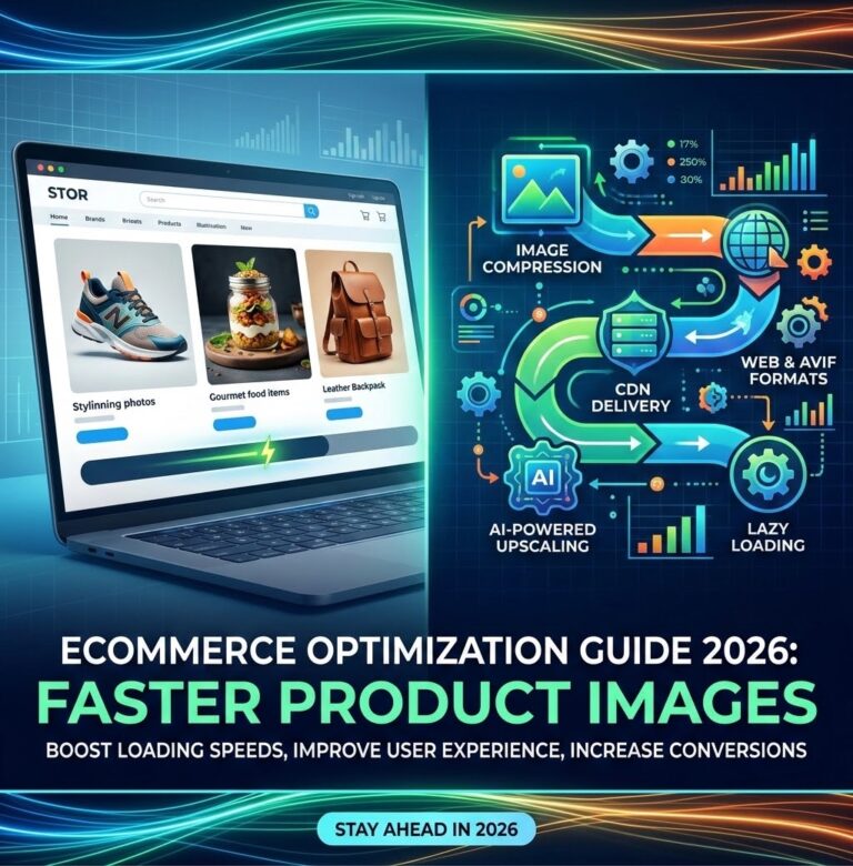
In 2026, optimizing product images isn’t optional. It’s the difference between a conversion and a bounce. Here’s exactly how to do it.
Why 2026 Changes the Game?
A few things have shifted this year that make image optimization more urgent than ever:
Google’s bot crawls are smarter. The search algorithm now gives heavier weight to LCP (Largest Contentful Paint) and CLS (Cumulative Layout Shift) — both directly impacted by image loading. Stores with slow images are dropping in rankings.
Mobile-first is the only option. Over 73% of e-commerce traffic now comes from mobile. A 2MB product photo that loads fine on desktop can take 6+ seconds on a 4G connection.
AVIF has gone mainstream. Browser support hit 93% in early 2026, making AVIF a real option for product images — often cutting file sizes by 50% compared to JPEG with better quality.
Step 1: Pick the Right Format for Every Image
Here’s the 2026 cheat sheet:
FormatBest ForTypical Size vs JPEGBrowser SupportAVIFProduct photos, detailed images40-50% smaller93%
WebPUniversal fallback, thumbnails25-35% smaller97%
JPEGLegacy compatibilityBaseline100%
PNGLogos, transparent images2-5x larger100%
HEICiPhone source files50% smaller than JPEGSafari only
Our recommendation for 2026: Serve AVIF as the primary format with WebP fallback and JPEG as the last resort. Tools like resizeimage.io let you batch-convert between any of these formats for free.
Step 2: Resize to the Right Dimensions
Here’s where most stores mess up. They upload a 4000×3000 product photo and let the CMS shrink it with CSS. That CSS doesn’t shrink the file size — the browser still downloads all 8MB.
Fix this by resizing images to their display dimensions before uploading:
Use CaseOptimal WidthProduct gallery (full)1200-1600px
Product thumbnail300-400px
Category page600-800px
Hero banner1920px (for retina)
Cart thumbnail150-200px
Use a free image resizer to batch-process your entire catalog. Set the exact pixel dimensions you need and export in your chosen format. No need to open Photoshop for every single photo.
Step 3: Compress Without Killing Quality
There are two kinds of compression:
Lossless — smaller file size, zero quality loss. Works great for screenshots, logos, and graphics with sharp edges. Expect 10-30% savings.
Lossy — much smaller files (60-80% savings) with barely perceptible quality changes. Use this for product photos, lifestyle images, and hero banners.
For e-commerce, a quality setting of 75-85% on lossy compression is the sweet spot. Below 70% and you’ll start seeing artifacts. Above 90% and you’re wasting bytes for no visible benefit.
Run your images through an image compressor to find the perfect balance. The best tools let you preview quality before downloading.
Step 4: Implement Responsive Images
This is the technical step that separates pros from amateurs. Instead of serving one image to all devices, serve different sizes based on the user’s screen:
“html`

product-1200.jpg 1200w"
sizes="(max-width: 600px) 400px,
(max-width: 1200px) 800px,
1200px"
src="product-1200.jpg"
alt="Product Name">
This ensures a phone user downloads a 400px image (~30KB) instead of the same 1200px image (~200KB) a desktop user gets.
For Shopify stores, many themes now handle this automatically — but only if you upload correctly sized source images. That 4000px upload still gets compressed server-side, often badly.
Step 5: Lazy Load Below-the-Fold Images
Don’t load images the user can’t see yet. Add loading=”lazy” to every product image that appears below the initial viewport:
`html`

The browser will only download it when the user scrolls near it. This single line can cut initial page load by 40-60%.
What NOT to lazy load: Your hero image, your first product image in the gallery, or any image above the fold. Those should load immediately.
Step 6: Set Explicit Dimensions and Use Aspect Ratio
One of the most common performance killers on e-commerce sites is layout shift — images loading and pushing content around. This destroys your CLS score.
Fix it by always specifying width and height:
`html`

Even better, use CSS aspect-ratio to let the browser reserve space before the image loads:
`css`
.product-image {
aspect-ratio: 1 / 1;
width: 100%;
height: auto;
}
Step 7: Don’t Forget Alt Text (For SEO + Accessibility)
Every product image needs descriptive alt text. This is a ranking signal and helps visually impaired users understand your products.
Good: “Women’s running shoes – blue and white – side view on grass”
Bad:
Keep it under 125 characters and include the product name and key feature.
The Bottom Line for 2026
Image optimization for e-commerce isn’t complicated — it just requires a systematic approach:
1. Convert to AVIF or WebP
2. Resize to exact display dimensions
3. Compress to 75-85% quality
4. Serve responsive sizes
5. Lazy load below the fold
6. Set explicit dimensions
7. Write good alt text
Do all seven and your store will load faster, rank higher, and convert better. Most of these steps take minutes per batch using free online tools — no Photoshop subscription required.
Need to resize or convert product images? Use resizeimage.io — it’s free, works in your browser, and handles bulk processing with no uploads to any server. Your product images never leave your computer.